Building Tricks and Optical Improvements:
Fast building with duplicate and rotate
In Room Editor there are ways to build faster and more efficiently. Here’s an example of how using the duplicate and rotate functions can speed up the creation process.
In our example we are going to use:
- Basic Floor Disc (Universal Object)
- Basic Cube (Universal Object)
- Shortcuts for manipulators, duplicating and multiselecting
After creating these two objects, we will scale the Basic Floor Disc a bit larger (5/1/5) and the Basic Cube to the desired size.
Consider placing your character close to the structure you are building, to better configure the size.
Now open the Chathouse Settings Panel (F6) and set the “Manipulator Rotation Step” on “9”. This way rotation will be rounded by 9 degrees.
Then, activate the Rotation Manipulator (E) and let it snap one time by clicking on the green circle. (ALT+LMB).
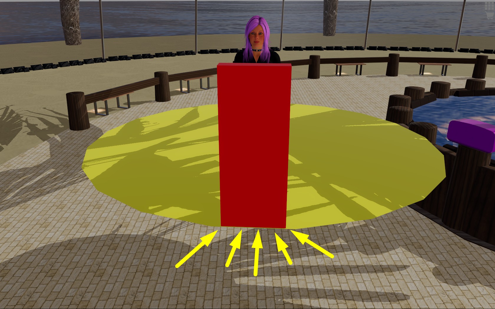
Now, set the Basic Cube on a side of the plane and adjust its position.
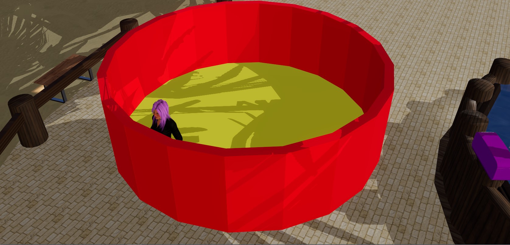
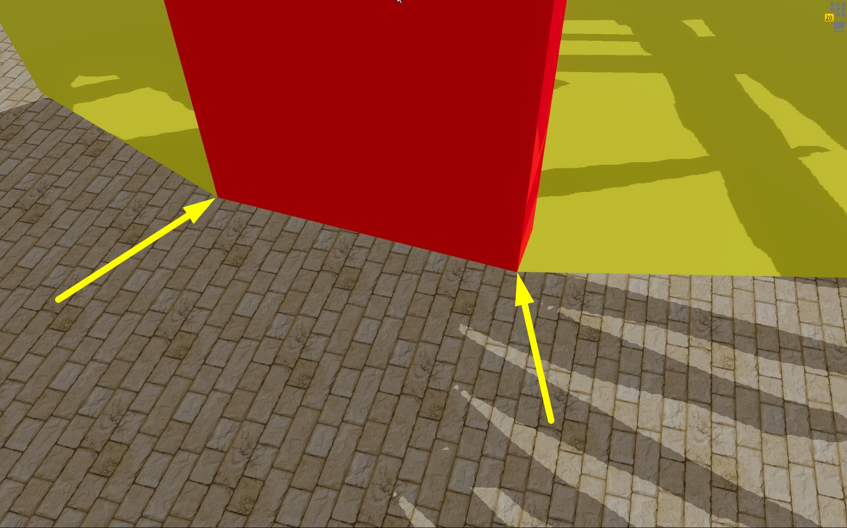
First make sure position and size of the objects match perfectly on the corners. Then, click on the Basic Cube (red) and then on the Basic Floor Disk (yellow) while holding Shift (for multiselection).
Then select both of them and use duplication (CTRL+D).
Rotate now the duplicated items 2 steps further then move the objects.
If it does not look right, just delete the duplicated objects and correct position and size (W and R).
Now we can select/duplicate the cube and the disc again and rotate them 2 steps further.
In our example it looks pretty good now.
We can now add the newly created cube to the multiselection and rotate it 4 steps and we repeat this process utill the circle is finished.
(Do not forget to click back onto the Basic Disc while holding Shift, otherwise you will turn around on one of the two cubes)
If you selected too many cubes, simply deselect them with CTRL+LMB
You can implement the same sequence to create more complex round structures. The basics are exactly the same.
Note: Do not forget to delete all the useless duplicated floor discs when you are finished!
Texture Scaling Tips
Scaling textures allows players to create better looking objects using a low definition texture simply by repeating the textures several times over the objects’ area. Scaling only works if your textures are “scalable” aka “seamless” or “tileable”.
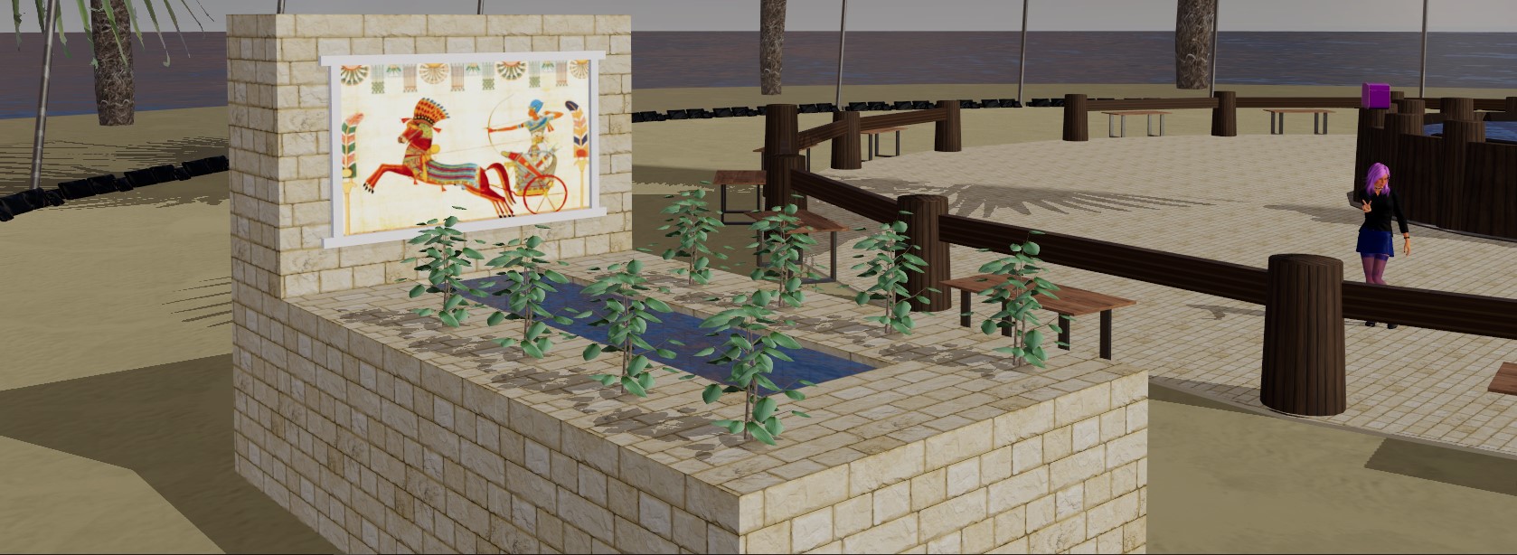
A seamless texture is defined as an image that can be placed side-by-side with itself without creating a noticeable boundary between the two copies of the image. That means that these textures are designed to be placed side by side and look like they are one single design. The floor and the fountain below are examples of that effect.
The fastest way to create a location is to copy objects. So, our suggestion is to spend your time applying the best textures, try and find the best color settings, set all the possible parameters to attain the best look. THEN, when your object is marvellously textured, copy the object over and over to create the parts of your location that are made with the same material.
This procedure works very well, but you will eventually change the size and shape of these objects and you will realize that the textures must be scaled to match the size change. All you need is some good old math.
Scaling textures:
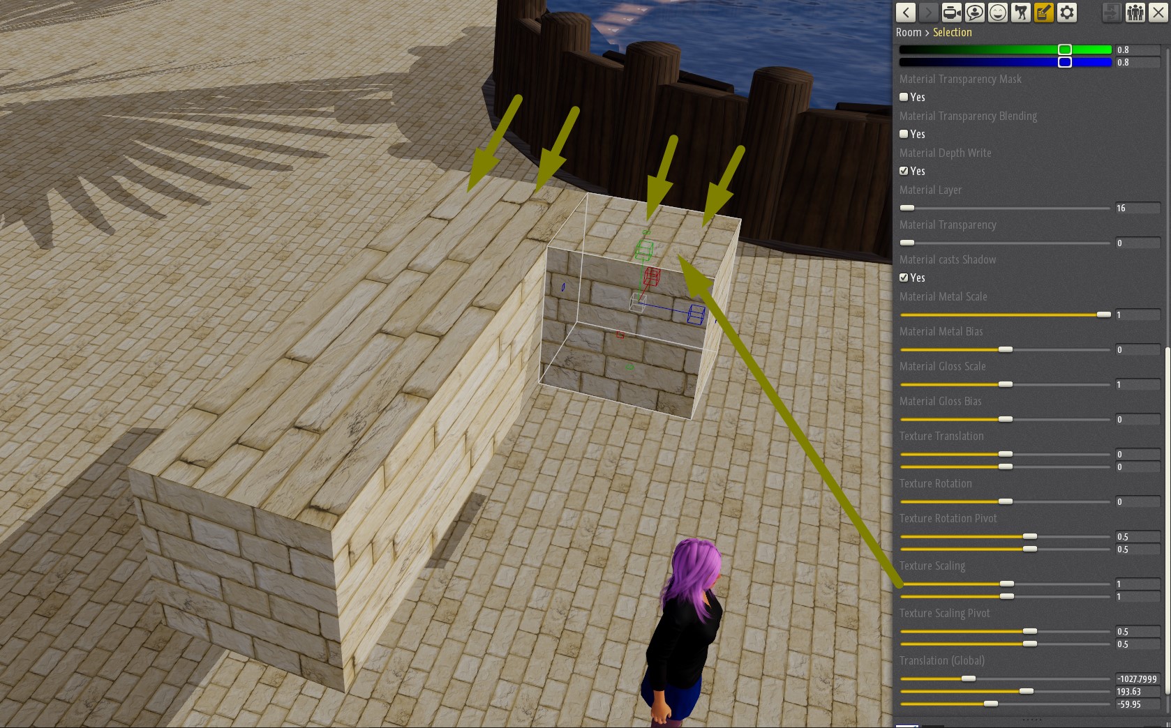
When copying and scaling an object, you just need to scale the textures accordingly.
In this example, first you take note of the size (scaling) of the original object and the size of the smaller copy.
Then you need to scale the textures, so you note the original (bigger) object Texture Scaling parameters and come up with the correspondent values for the new smaller one.
Note: Scaling works for only 2 dimensions, the 3rd one remains unscaled. If you don’t like the look, try and rotate the object.
Tip: If you use textures that are already scaled to roughly cover an area the size of 1 meter X 1 meter, you can use the same values for both Scaling and Texture Scaling.
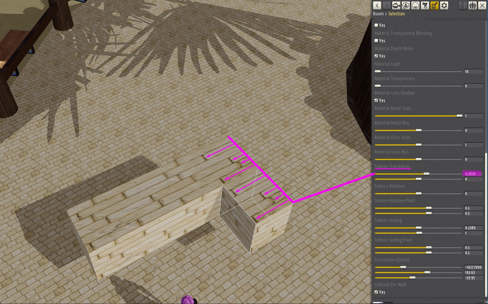
Once the textures are scaled, you may need to play a bit with the Texture Translation Slider to adjust the texture placement on the new object to make it match the original one.
Correct light setting
The main suggestion we can give you about lights is to limit their number to 3-7 in each area of your location for performance sake. Less is always better for older systems.
You should also be aware that playing with the lights settings can really improve the look of your room. You can find more details on lights here.
Tip: Use the color sliders to attain the best effect. You can also set intensity and radius to cover the correct area. Always place your avatar close to the light source and move it around to see the final effect. You may hate the strong light effect on the character’s face if the light intensity is too high.
Tip: Remember that light penumbra angle and light cone angle work only with lamps.
How to quickly create Stairs
You can build stairs quickly and effortlessly.
- First Create a Universal Cube.
- Then choose the height/ width (the value has to be identic). In our example we choose 0.30. (measured in meters)
- Now insert your texture and scale/customize it as you wish. We did not make too many changes in our example exept for the walk collision which we turned off (otherwise you need to disable all of it later…).
- Open the Settings Panel (F6), scroll down to “Location Editor Settings” and set the value of “Manipulator Translation Step” at the same same value. In our case we choose 30 since the scale is in centimeters.
- Duplicate the object (CTRL+D)
- Now hold “ALT” and move the object one step up and one to the side.
- Now use the multiselection (Shift + LMB) to select both objects and repeat the steps above as many times as you need.
- Then add also a floortile, otherwise you can not walk on your creation: click on one of the objects at the middlepoint and duplicate it.
- Now change to “Floor tile”, remove the Color/ Metal and Normalmaps and set the rotation 45° degree.
- Stretch the Floortile now with the Scale Manipulator untill the stairs are fully covered.
- Activate Walk Collision of the Floortile.
- Duplicate your Floortile and place/ scale it onto the last stair and connect the end with the large one.
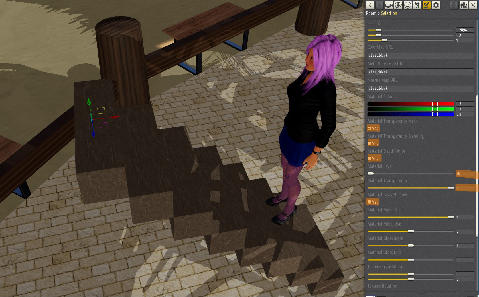
- At last you need transparency for your Floortiles. The picture below will show you the settings for it.
Sky Background Customization
Empty rooms feature a customizable sky. This amazing feature can help you enhance greatly the look of your locations as long as you clearly know the limits of this object.
First of all, the sky texture is the largest picture allowed in Chathouse (2048X1024 pixels), and there is a very good reason for it: a low definition sky texture looks awful!
The other limit is related to positioning the sky dome correctly. When you move your camera to a higher point of view, you may notice that the lower part of the sky dome starts showing up. That is why we have a “haze” object to hide the transition between the plane at ground level and the sky.
The images that best fit the sky texture are 360 degrees panoramic picturess and HDR images that must be converted into JPGs or PNGs. The overrall object that is created is a sphere composed by the sky dome and all the area underneath. All 3 dimensions are scalable.
Tip: Use the largest image available, which means don’t go lower than 2048X1024 pixels!
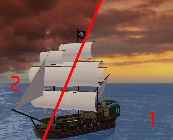
Tip: Try and use texture scaling when possible. The sky texture includes all the area underneath the ground/sea level which is rarely shown (1). In your texture you may choose to have the sky part only and double the texture scaling (2) in order to double the sky resolution in your room. 360 degrees images are seamless by definition, so they will transition into the second copy softly. Just be careful to use a picture where the sun is not clearly shown otherwise you will end up with 2 suns!
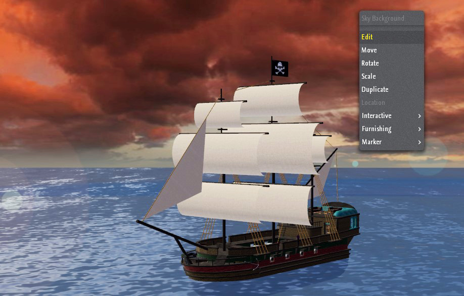
Tip: If, by including only the sky in your sky texture, you end up with a picture where the proportions between width and hight are not respected anymore (as you should), you can still scale the height of the sky background object to half size. The sky will then look perfect (image below).
Tip: disable all transparency and shadow features to save memory and graphic card resources since you don’t need them.
Tip: when using the haze object, use a very smaller size compared to the sky dome. In this example the sky background is scaled as 6000/3000/6000 while the haze is scaled down to 700/200/700. This is necessary to display the haze correctly.
Tip: Play with all the haze settings to get the best result. You can tweak saturation, luminosity and color.
Allowing objects below a waterplane/Picturewalls) to be selected in game
After placing a Waterdisc/Plane/Picturewall, you might not be able to interact with objects underneath (like Floortiles or Furnitures) anymore.
There is an easy way to fixit:
- Click onto the Waterdisc/Plane
- Turn the object 180° around and activate “Material Backside Visible”. (Not required for the Picturewall.)
Note: In the Room Editor you can click on these objects from only one side!
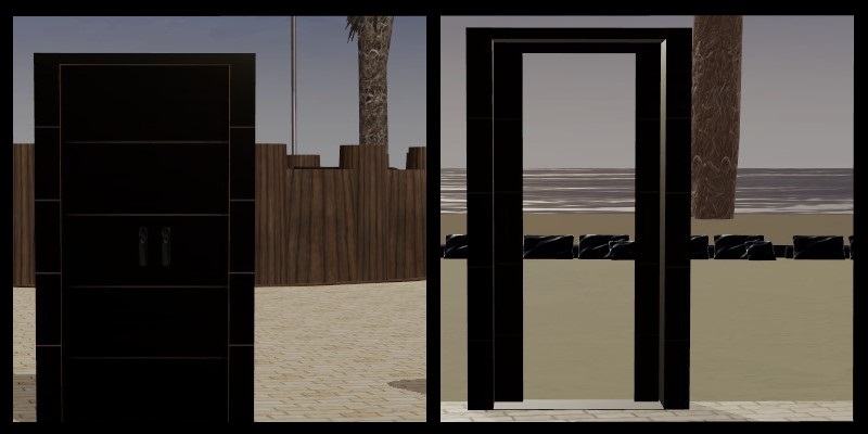
Build a Curtain (or Door) with open/closed Effect
To create a passsage through Doors or Curtains you will need:
- A Universal Object (Floor Tile)
- A Rug
- A Picturewall
All three of those are transparent on one side.
Leave walk collisions unchecked (OFF).
The camera will still collide when you go through the door, but the avatar will be allowed through.
Best Use of the Transparency feature (Glass, Water,...)
As stated before, transparency is not really a friend of performance, but still looks great. The best use of it would be on smaller objects and areas, like glasses or small pools.
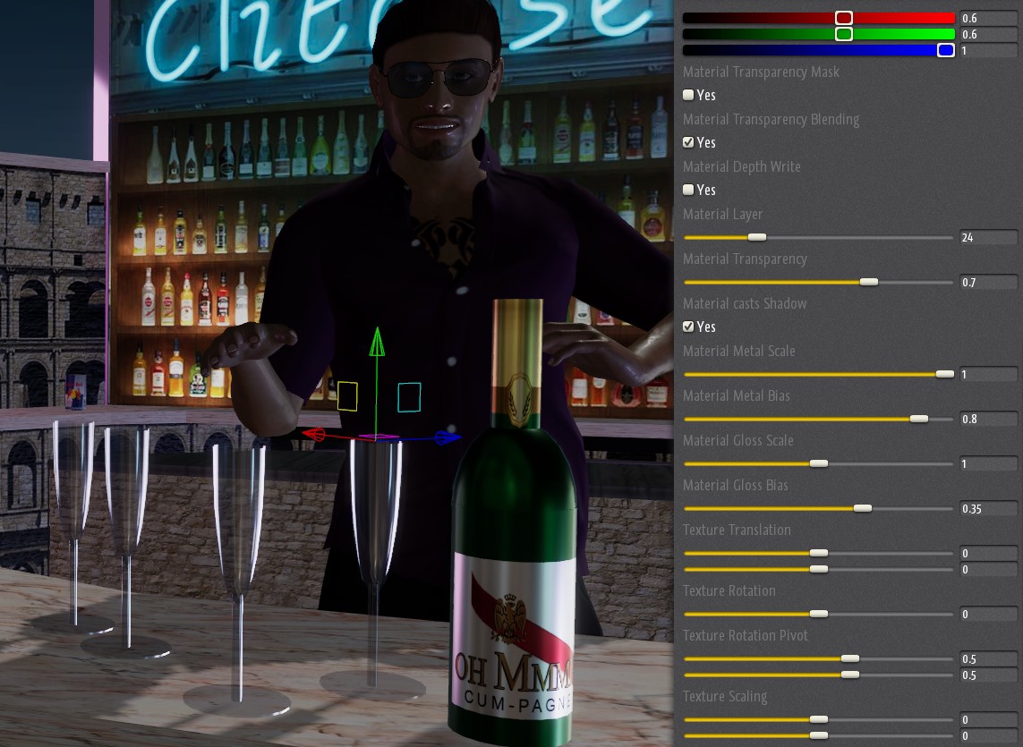
Creating real-looking glass is now possible using transparency.
- First of all you need to set the material right, so pick one universal object and set texture scaling to 0 for both horizontal and vertical fields. This way you do not need any texture. You can also use the color sliders to add a tint to the glass you are creating.
- Then activate Transparency blending and set the transparency to attain the results you like the most. Remember, it is a transparent object now, so set the depht write OFF and adjust the material layer setting to fix transparency issues if needed.
- Now use Metal Bias and Gloss Bias to create the glass effect you are looking for (hig metal settings are suggested).
- Cheers!
Using images and blueprints as reference
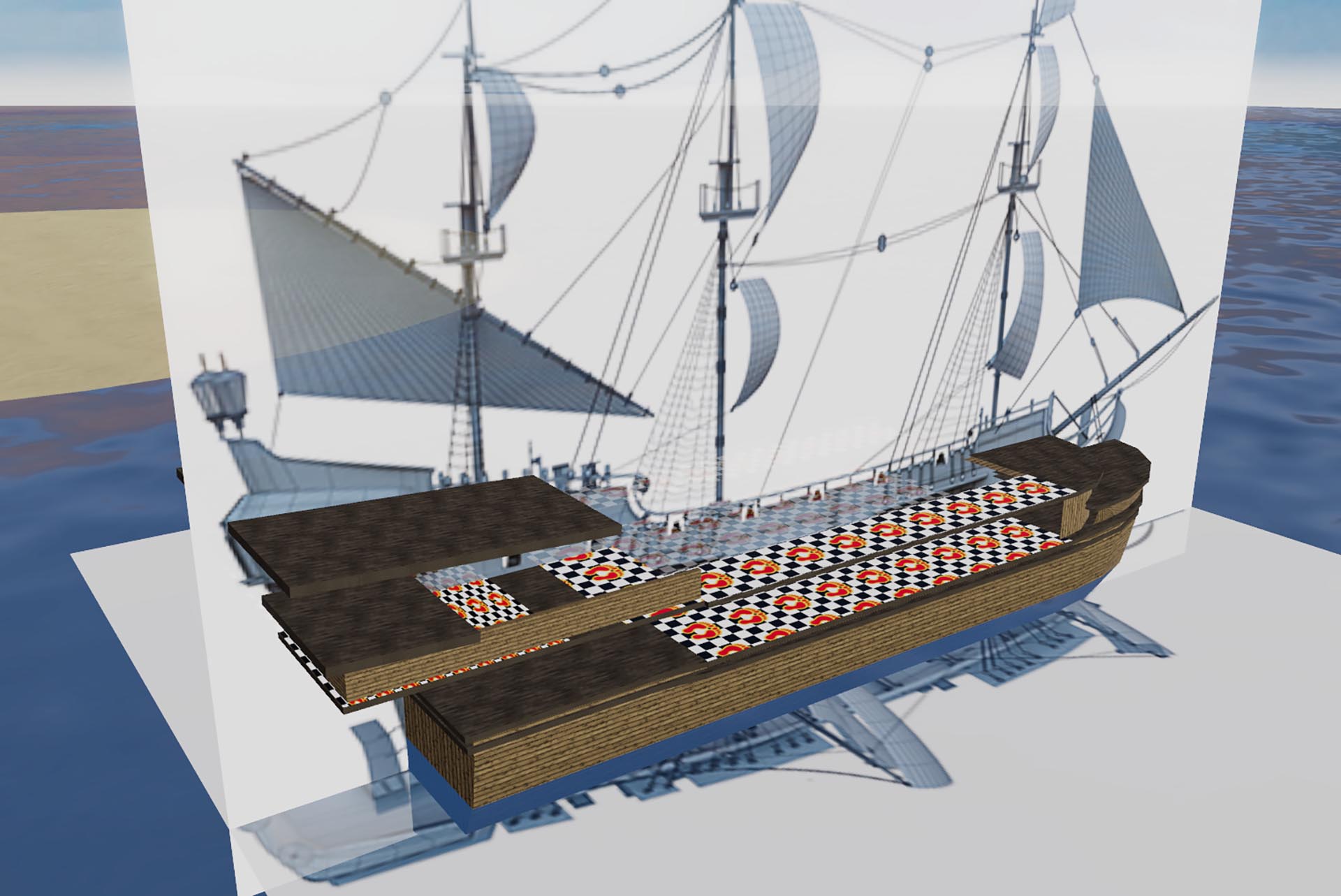
In Chathouse 3D it is possible to use an image, a scheme or a blueprint as reference for your creation. When creating a complex object, a detailed reference may help you save time and create a better shape of the structure you want to represent.
Tip: Simply add the image to a Picturewall or Universal Object and locate it in your room. Then build around it using the image as reference.
Tip: Move your avatar close to the reference picture and add some interactive objects to help you set the correct proportion of the structure you want to create.
Multi-level feature
The Multilevel feature in Chathouse 3D allows you to have different floor levels. There are mainly 2 different behaviors of this feature depending on your level setting.
1- Floor levels that are assigned the same level number can be placed close to each other and you can walk over them as if they were one single surface. If you place one on top of the other your avatar will bolt to the upper level as soon as its behind it regardless of the vertical distance. If the 2 planes are far away the effect is “teleport-like”.
You can consider it like if each character knows exactly which “Floor” it is on and places itself on the topmost level of the same floor-number.
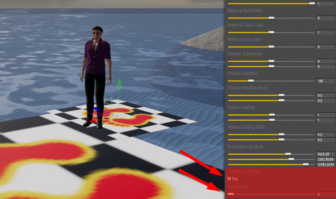
Always remember to activate collisions (“collision for walk” must be checked).
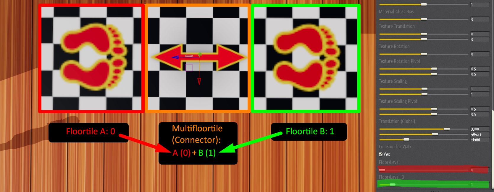
2- Floor levels that are assigned A DIFERENT level number can be connected only by a Multifloortile (Connector) .
That is very useful if you wish to create areas where avatars can enter or exit only from the exact points where you place the connectors.
Multifloortiles can be rotated and manipulated and may connect different levels regardless of the distance.
When using connectors you must rememeber to insert the level numbers of the two floortiles which you want to connect (in this case Floorlevel 0 and 1).
The best result is archieved placing the connector with the arrows in the direction of the 2 floortiles that need connecting. A different placement may cause bugs.
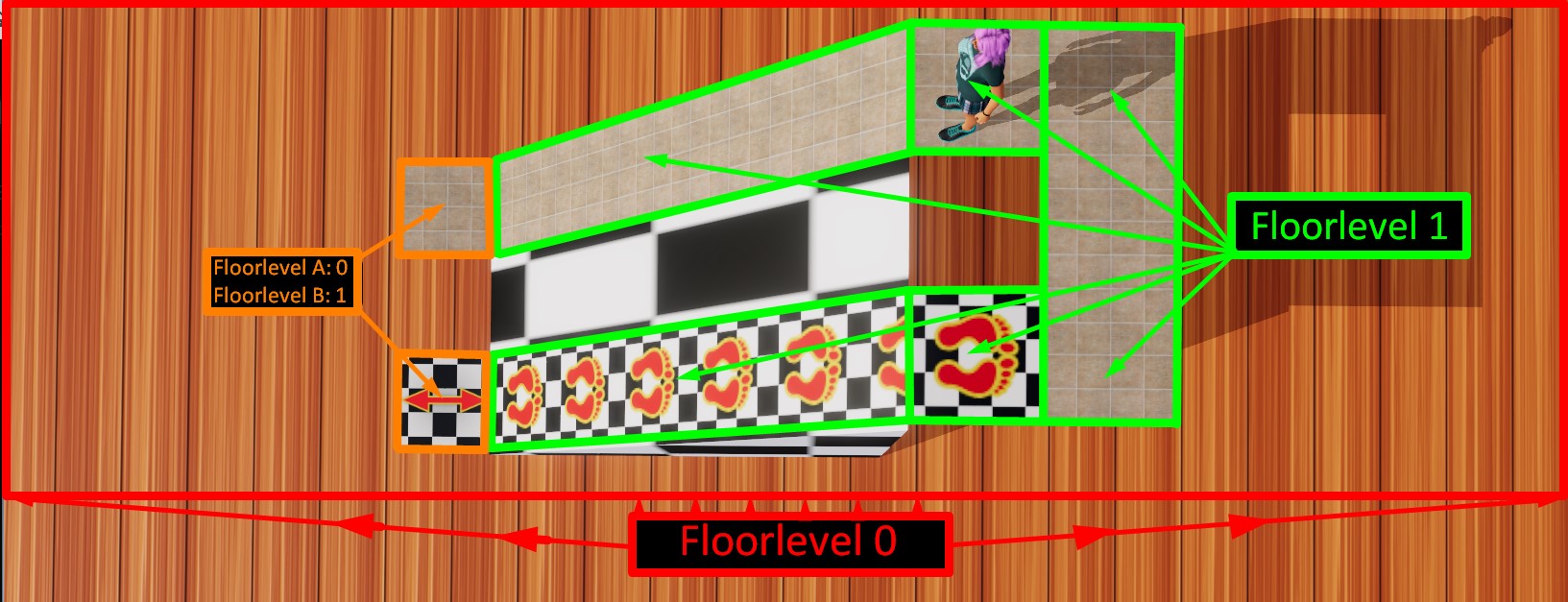
Here’s an example:
Starting with the larger floor (Floor A: level number 0), we then create another Floorlevel (Tiles B: level number 1) for our little upper plattform.
Now we just place the Connector in a position where its extremities touch the 2 different levels and set the Connector parameters to:
Floorlevel A: 0 (Floor)
Floorlevel B: 1 (Tiles)
Remember to activate the collisions for all the Floortiles/Connector and also check other objects which may block your avatar movement (collisions must be OFF for these objects).
There is also another option that you can use if you find this first method buggy. In some situations ramps may not work properly. If that is your case, just add a multifloor tile right on top of the lower floor level, then use a simple floor tile as a ramp to the other level.
You can find an example in the image below.
Building an Elevator
It is possible to build an “elevator” in Chathouse with function.
All in all it is not really hard to create one.
All what you need are the Universal Objects I and Universal Objects II packs from the thriXXX shop or an active Chathouse 3D subscription.
The principe to build an elevator is simple:
As “Buttons” you need the Floortiles and as elevator (levelchanger) you have to set the Multifloortile.
We will show you how it goes with the following example:
We build an building with an elevator which has to reach 3 different floors.
The Floortiles (Elevator Buttons) need to set in a rotation 90° degree (vertical and walk collision off) has to set like that:
Level 0 = Floor level 0
Level 1 = Floor Level 1
Level 2 = Floor Level 2
Level 3 = Floor Level 3
The Multifloortiles (Connector) you need to place into the Elevator (walk collision on). We used the green numbers for getting an level up and the red numbers for getting an level down.
Floor Level 0:
Upstairs (green):
Floor/Level A = 1
Floor/Level B = 0
Floor Level 1:
Downstairs (red):
Floor/Level A: 0
Floor/Level B: 0
Upstairs (green):
Floor/Level A: 2
Floor/Level B: 1
Floor Level 2:
Downstairs (red):
Floor/Level A: 1
Floor/Level B: 1
Upstairs (green):
Floor/Level A: 3
Floor/Level B: 2
Floor Level 3:
Downstairs (red):
Floor/Level A: 2
Floor/Level B: 1
For the arrows which are outside of the elevator( up and down) we used the following Floortile setup:
Arrow Level 0:
Upstairs (green) Floorlevel 1
Arrow Level 1:
Upstairs (green): Floorlevel 2
Downstairs (red): FloorLevel 0
Arrow Level 2:
Upstairs (green): 3
Downstairs (red):1
Arrow Level 3:
Downstairs (red): 2
As help we have this example video for you where you can see the process from start to the end.
Building Interactive Furniture
Creating realistic Glasslook
It is pretty easy to create a realistic glasslook without any textures and that very quick!
All what you need is to use the settings like in the following video.

